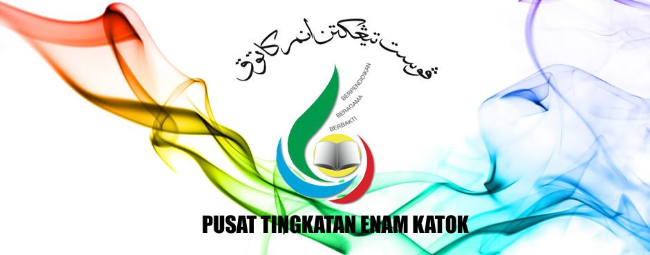
Pusat Tingkatan Enam Katok's Logo is represented by a circle with three wings. It incorporates MOE's Vision which is "Quality Education towards a Developed, Peaceful and Prosperous Nation" and its Mission "To Provide Holistic Education to Achieve Fullest Potential for All".
The main graphic elements of PTEK Logo are:
- An opened book which provides knowledge that is the key to success.
- Circle in the middle symbolize well rounded education.
- Three wings that originate from the inner circle.
- The circle also represents the centre's vision "Enhance Teaching and Learning for Individual Excellence."
- The three wings carry the centre's Motto, "Berpendidikan, Beragama, Berbakti" and also represents our mission "To Provide Opportunity For All Students To Realise Their Potential and Become Better Citizens".
- The right wing in red represents that action is needed to equip students by providing every opportunity.
- The lower wing in blue represents their potential.
- The left wing in green represents the final stage of the cycle, the wing soaring upward, signifies students "becoming better citizens".
- The colour YELLOW symbolizes the monarch and the MIB concept.
- The colour GREEN symbolizes life, growth, renewal, health and religion.
- The colour BLUE symbolizes intelligence and stability, importance and confidence.
- The colour RED symbolizes outstanding creativity, revolutionary thinking and continuous strength.